The
Colors
of 2027
Three greens, one bold trend, and the colors I’d rethink before you sell.
By Lisa Hannah-Leff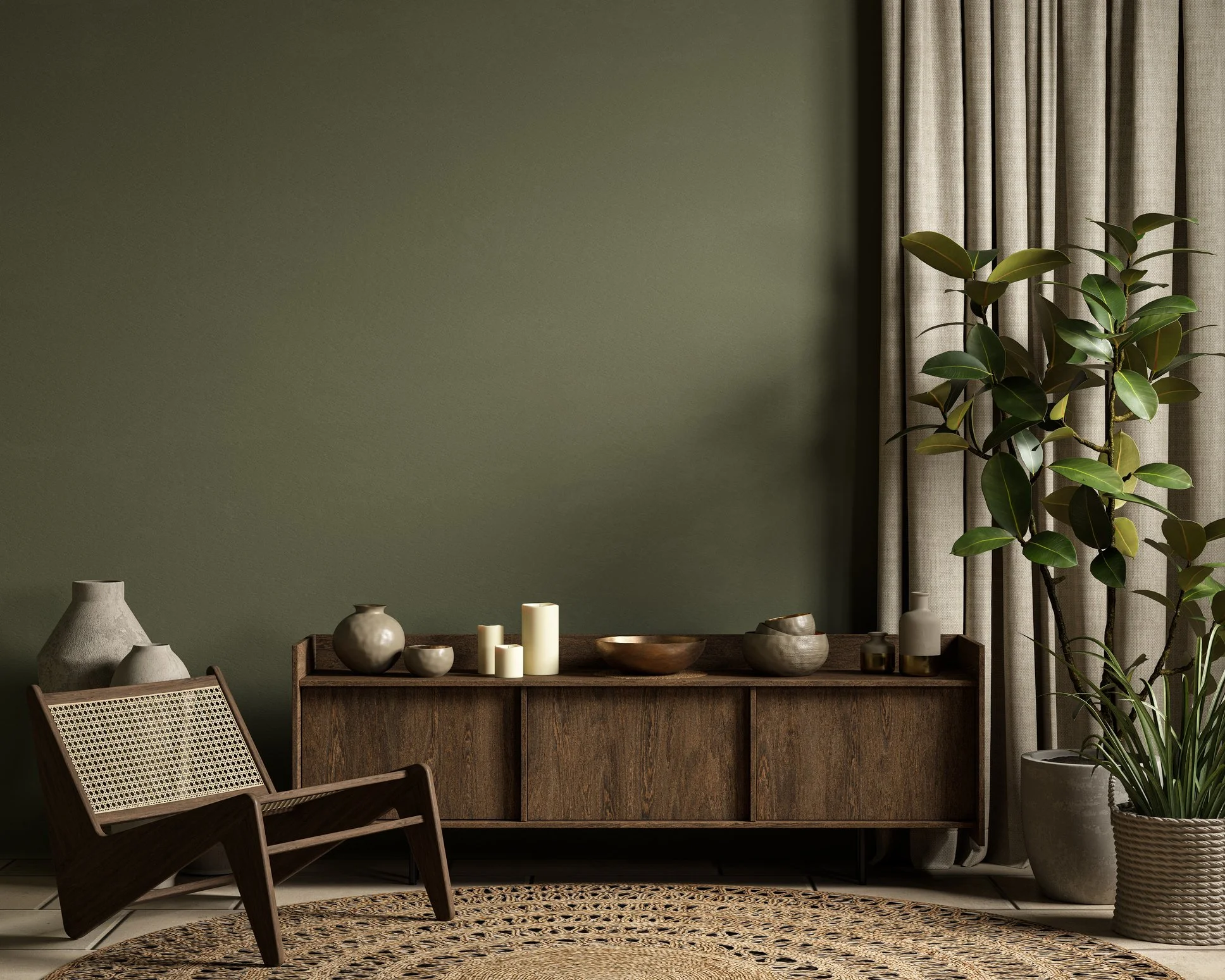
Every fall, the big paint companies name their Color of the Year, and it’s one of my favorite announcements of the season. This year, three of the biggest landed in the same family: green. One light and fresh, one mossy and warm, one deep and classic.
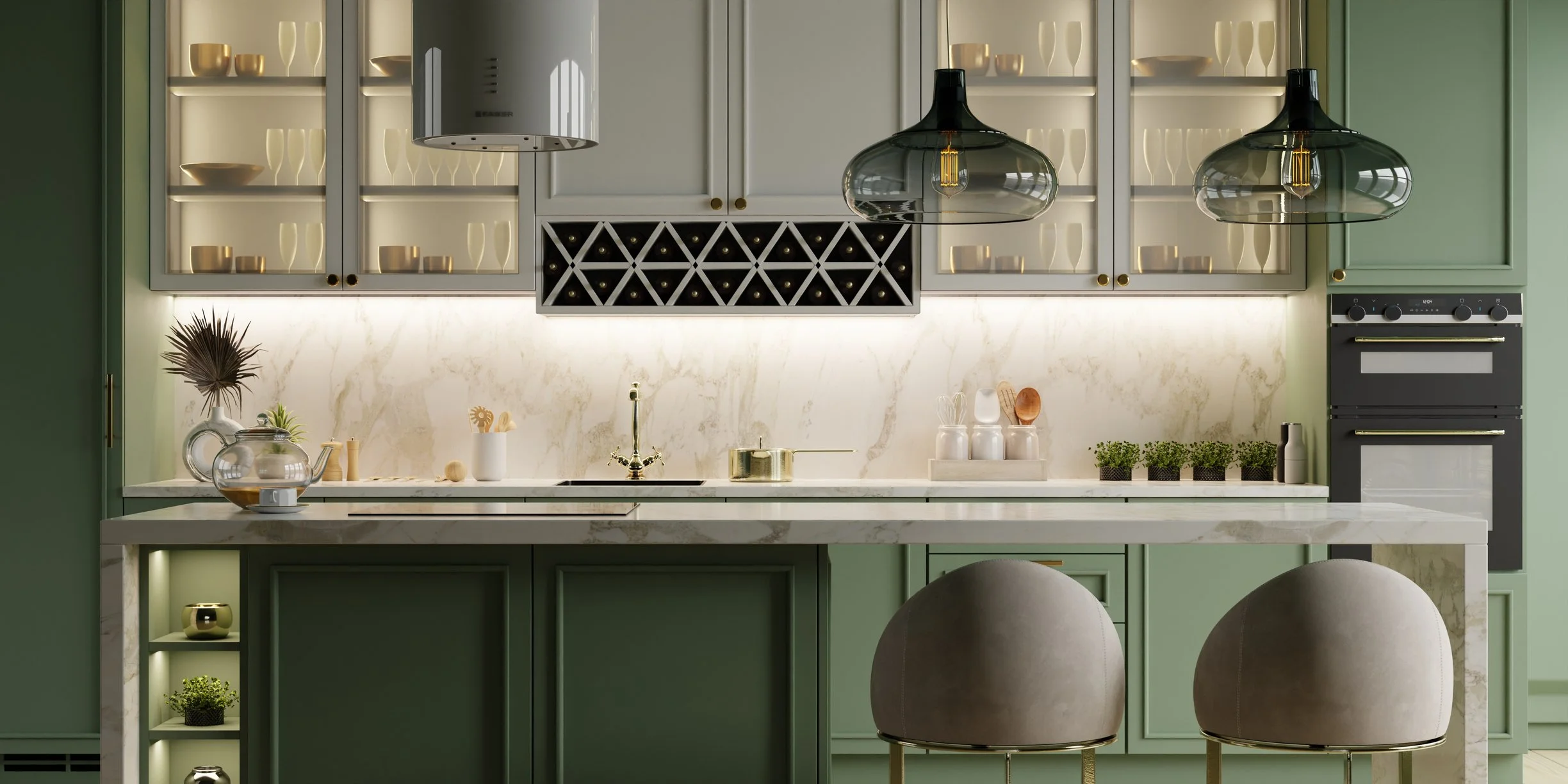
Light, fresh and a little unexpected. Celery sits somewhere between sage and soft butter yellow. Sherwin-Williams calls it a “tinted neutral,” and I think that’s exactly right: it gives a room color without taking it over.
I love it on kitchen cabinets, in a sunny breakfast nook, or anywhere a home has a little cottage charm. Pair it with white oak, crisp white trim and a touch of brass.
A little afraid of green cabinets? Try it on an accent first, like the kitchen island, or even in the laundry room.
The moodiest of the three. Grounded is a mossy olive with an earthy brown undertone, rich without feeling heavy.
It’s beautiful in a bedroom where you want the walls to wrap around you, and it loves warm wood, leather and creamy linens. For a smaller dose, try it on kitchen cabinets or painted window frames.
Behr marked ten years of naming a Color of the Year by donating $250,000 to Habitat for Humanity, to help families into homes of their own.
Each of these greens is gorgeous next to a soft, neutral off-white, and that’s exactly how I’d use them. Benjamin Moore pairs Webster Green with White Down, and Sherwin-Williams pairs Celery with White Flour. Choose one green for one room, or one special spot like the kitchen cabinets or the front door, and let a warm off-white carry the rest of the house.
Green deep & classic
The classic green, the one that never really goes out of style. Webster Green is deep and rich, and it isn’t new at all: it comes from Benjamin Moore’s Historical Color Collection.
It’s gorgeous on a front door, on a library wall, or as trim on a brick house. Benjamin Moore even suggests flipping the usual look: Webster Green on the trim, soft off-white on the walls.
Color drenching is exactly what it sounds like: one color on everything. Walls, ceiling, trim, doors, even the built-ins. No crisp white trim to break it up. Instead of a room with painted walls, you get a room that feels wrapped, finished and surprisingly calm.
Most people think a small room needs light paint to feel bigger. I’d gently disagree. When the walls, the ceiling and the trim all melt into one deep color, the corners seem to disappear, and the room feels deeper and more intentional. A small room was never going to feel huge, but it can feel like a jewel box.
Interior designer Shea McGee told Homes & Gardens that a dark color in a small space is “the best surprise,” and I couldn’t agree more.
The color stays the same. The sheen is what gives it depth.
The one place I’d hold back: a long, narrow hallway with little natural light. There, a deep drench can feel heavy. Save the drama for the rooms where you sit and stay awhile.
I’d rethink before you sell
Paint can always be changed, so a color is rarely a deal breaker on its own. But buyers notice, and they do prefer up-to-date colors. Neutral is still the safest choice, and I’ve noticed that homes in fresh, current colors sell faster.
When buyers walk into a room they’d have to repaint, they start adding up the work instead of picturing their life there.
Bold, saturated main rooms.Fire-engine red, bright orange or lime in the living room or kitchen. Save the bold color for your next home.
The golds and heavy tans of the early 2000s.Warm Tuscan walls were everywhere for years. Today they can make a home feel older than it is.
Bright kids’ rooms and themed walls.A lime-green bedroom or a painted mural is darling for your family, but buyers see a weekend of painting.
A different color in every room.A house full of competing colors feels choppy. One calm palette flowing from room to room makes a home feel bigger and more connected.
Wall-to-wall cool gray.The all-gray look has faded. Warmer whites and soft greige feel fresh now.
If you love Celery on your kitchen cabinets or Webster Green in your powder room, enjoy them. Current colors in the right places can still read fresh to buyers. Before you list, it’s worth a walk through your home with fresh eyes. Sometimes one or two rooms are all it takes.
Paint is still the least expensive way to change how a home feels.
Color details from the 2027 Color of the Year announcements by Sherwin-Williams (September 15, 2026), Behr Paint Co. (September 2026) and Benjamin Moore (October 14, 2026). Shea McGee quoted in Homes & Gardens. Colors on screen are approximate, so always sample paint in your own light.